Overview
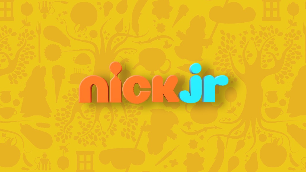
I teamed up with Imaginary Forces and Karin Fong to renew the branding for Nickelodeon's Nick Jr. television network. The comprehensive rebrand consisted of laying a new foundation based on their 'A smart place to play' positioning. Nick Jr. prides itself on being educational and fun, a place where parents can confidently bring their kids to. The positioning needed to be a brand that is stylish, fun, engaging and ownable.
A place to play should be many things—big and small, simple but with infinite possibility. It should be structured enough to be specific, yet open enough to imagine many different stories.
Brand Elements
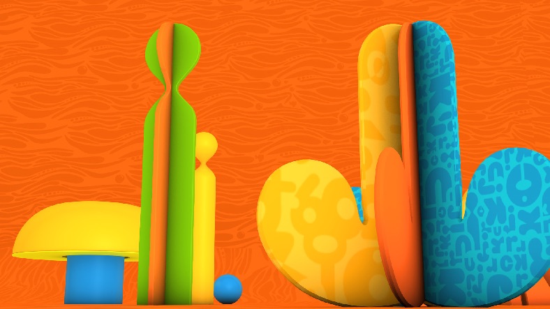
From crafting a vibrant new color palette to selecting modern fonts, the design required a bespoke system of interchangeable components, akin to an erector set of pre-fabricated units. These modular elements were inspired by the curves and proportions of the Nick Jr. logo. When integrated with the network's shows and themes, they would coalesce into a comprehensive brand kit.
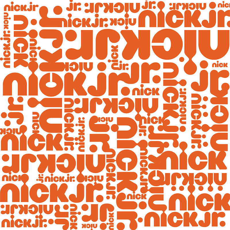
TYPOGRAPHY / BRYANT BOLD


NICK ORANGE
CORAL BLUE
LIMON YELLOW
LEAFY GREEN
SPACE BLUE
PURPLE HAZE
PATTERNS


PATTERNS
Environments
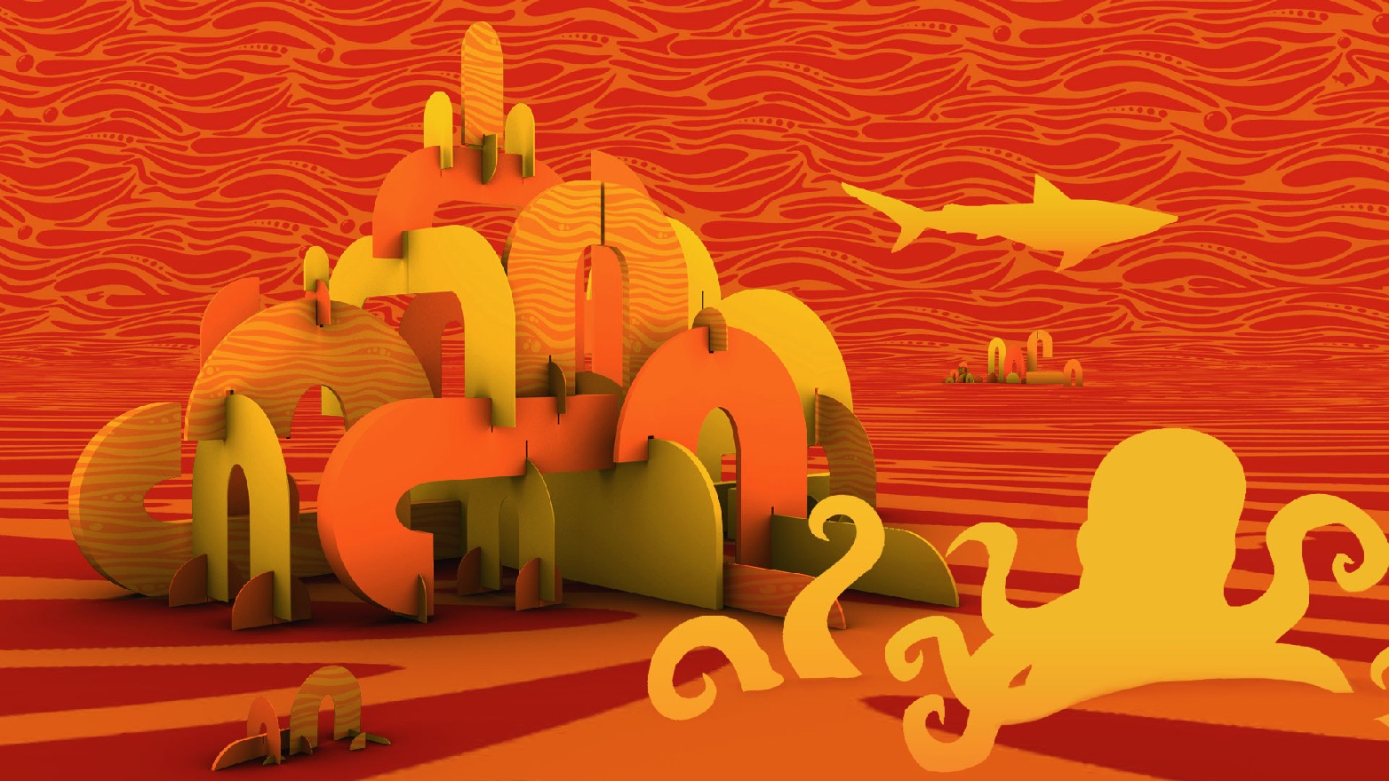
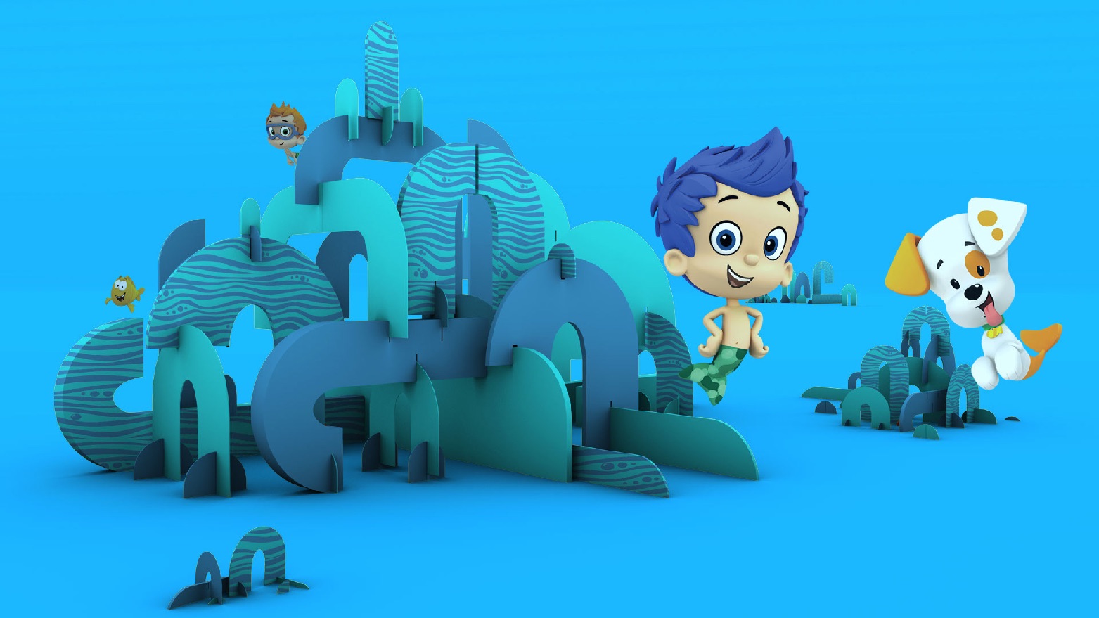
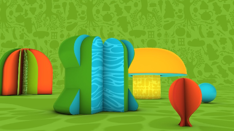
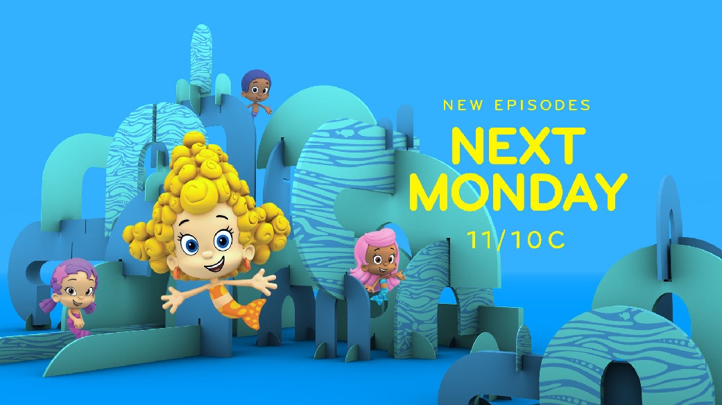
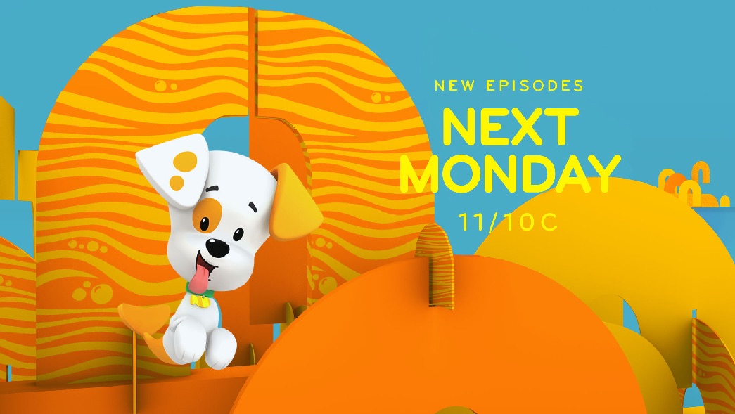
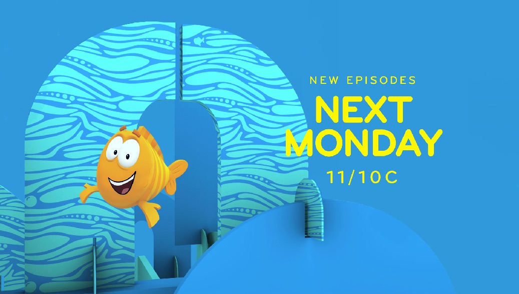
We used the brand kit of patterns and shapes inspired by the Nick Jr. typography to create environments for our branded world. These environments (stage sets) are made with 'flat pack' extruded shapes to create worlds that characters interact and play with.
ENVIRONMENTS

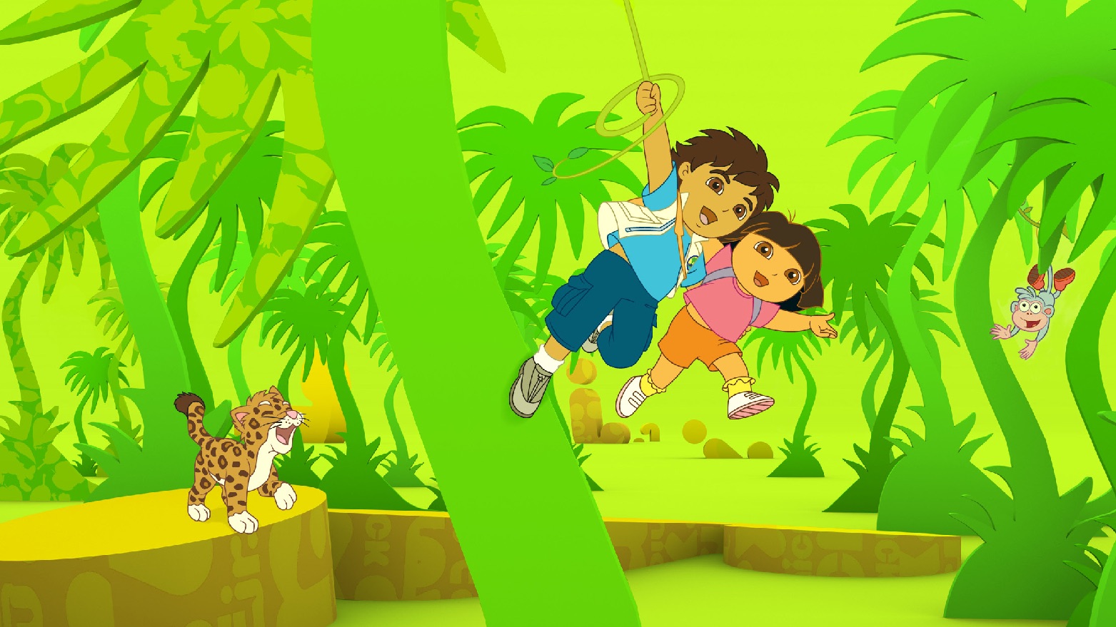
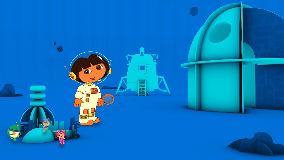
ENVIRONMENTS WITH CHARACTERS
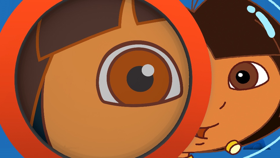
Network Package
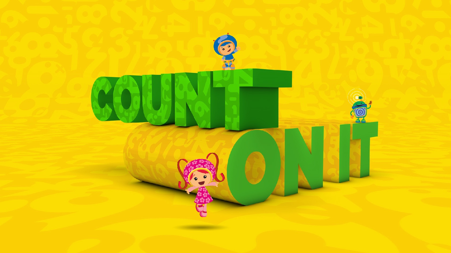
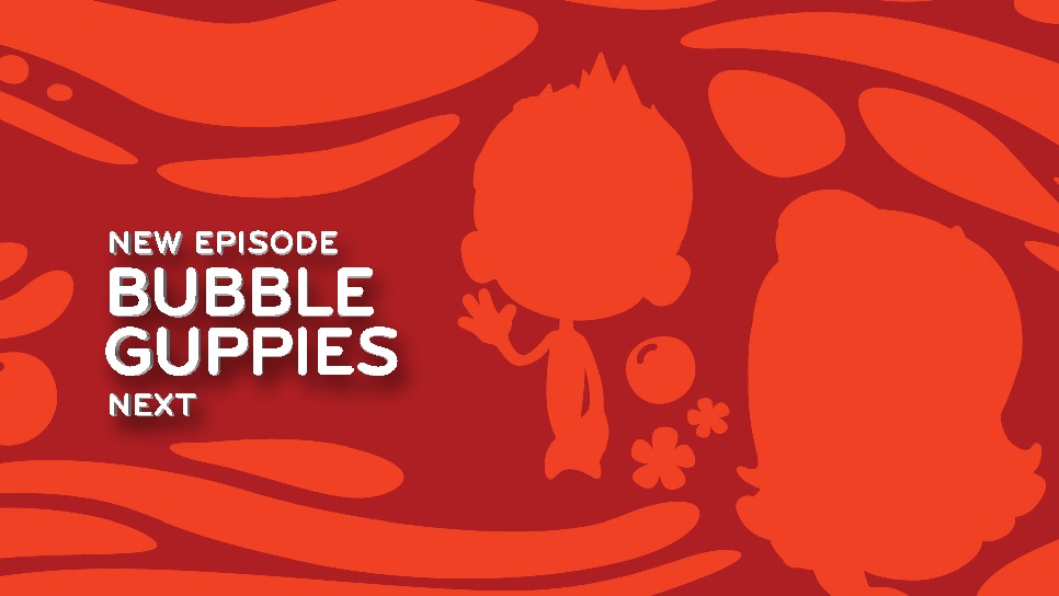
The network package starts with the network logo ID, and is supported by components that inform the viewer. Components include 'bumpers', 'menus', network promos and interstitials. They are designed to be modular and incorporate typography, show characters and other designed elements.
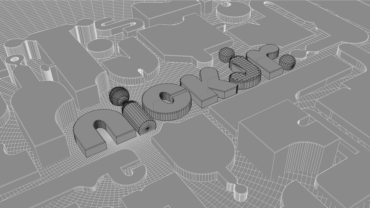
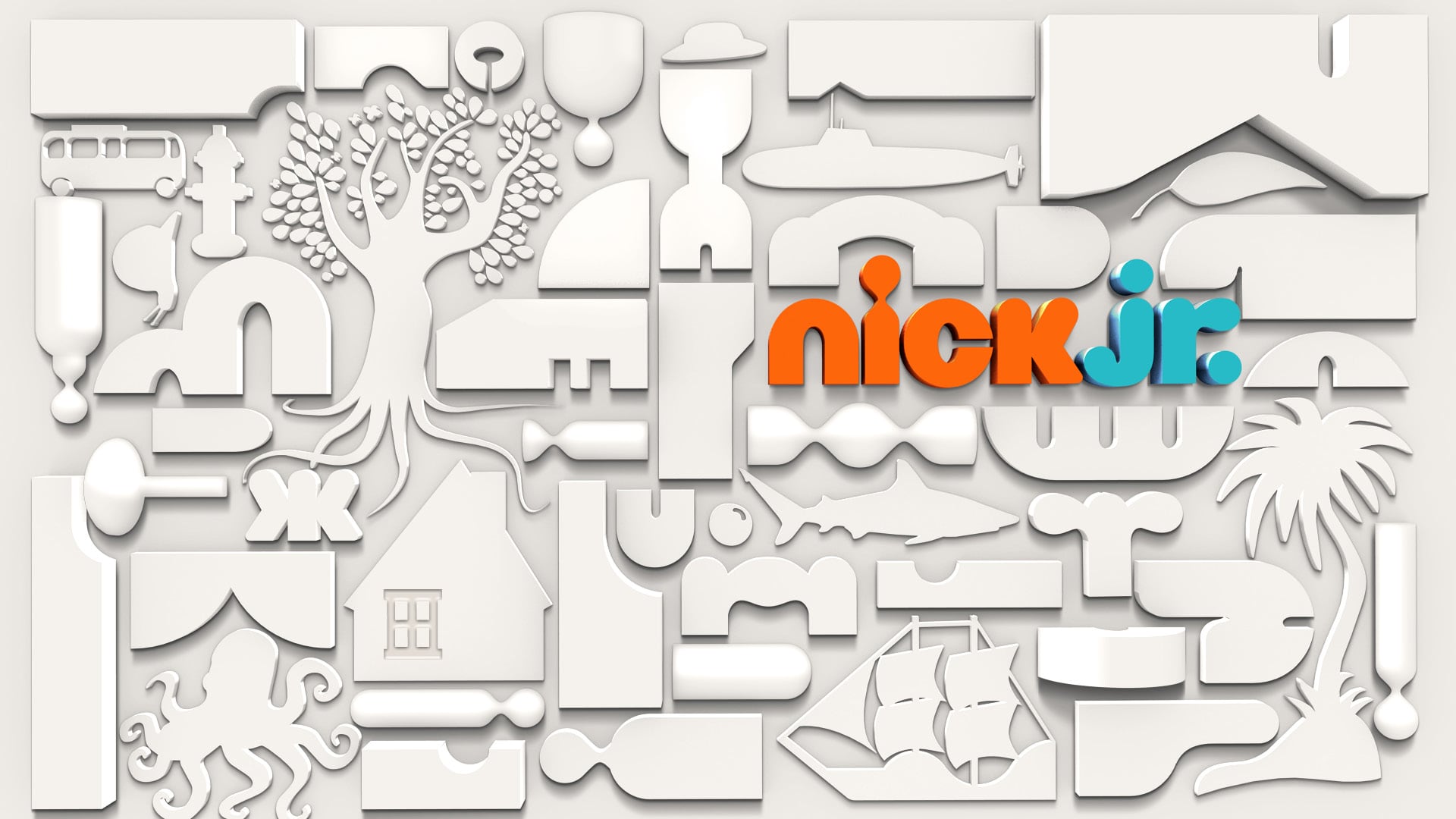
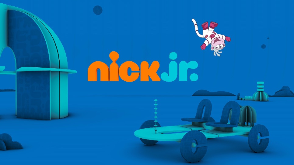
MAIN LOGO ID ANIMATION SEQUENCE


LOGO ID ANIMATION SEQUENCE WITH CHARACTER INTEGRATION

BUMPERS USING PATTERNED BACKGROUNDS


ENDPAGES
MENUS WITH ENVIRONMENTS AND CHARACTERS


INTERSTITIALS